RaceAmerica — Principal UX/UI Designer & Brand Lead
Platform: Web, Software, HMI, Redesign
Audience: The Track Timing Operator, Race Administrator


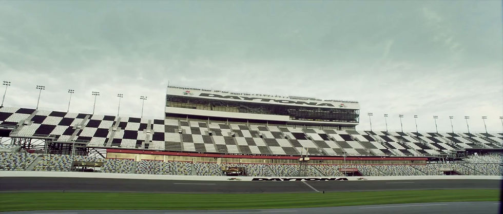
RaceAmerica is a US-based manufacturer of professional timing, scoring, safety, and display systems for motorsport — with products deployed at over 1,000 facilities worldwide across drag racing, autocross, road course, oval, karting, and boat racing disciplines. Their hardware and software ecosystem serves major sanctioning bodies including NHRA, IHRA, SCCA, USAC, PDRA, NMRA, NMCA, and NASA.
Every product is designed, assembled, and supported from their facility in the United States. RaceAmerica holds multiple patents covering T-Link wireless timing technology and has operated for over 35 years as the trusted timing infrastructure behind professional motorsport.
I joined RaceAmerica as the principal and sole UX/UI designer, taking full ownership of the design function across the company's entire digital and product ecosystem. Over the course of the engagement I led and executed every dimension of the design practice — user research, information architecture, interaction design, visual design, prototyping, accessibility auditing, usability testing, design system creation, brand identity, and website redesign — working in close collaboration with front-end developers, engineering leads, and executive stakeholders throughout.
This was not a scoped single-project engagement. I owned the full design function across multiple simultaneous product workstreams with no other designer on the team. Every deliverable described here — from a brand identity system to a safety-critical HMI used at NHRA national events — was researched, designed, tested, and handed off by one designer operating at principal level.

Scope of Work
Brand Identity
Designed RaceAmerica's brand identity system — including the logotype and complete visual language — establishing the typographic, color, and graphic foundations that carry across the company's products, communications, and digital presence. The brand system was built to function across digital interfaces, physical event environments, printed timeslips, scoreboard displays, and marketing materials — reflecting the precision and reliability that define RaceAmerica's 35-year reputation in professional motorsport. Photo and video content creation.
Website Redesign
Led the full redesign of raceamerica.com — restructuring the information architecture to communicate RaceAmerica's complete product ecosystem (50+ hardware and software products across all racing disciplines) to a global audience of track operators, sanctioning bodies, and facility managers. The redesign aligned the public-facing brand with the design system established across the software products, creating a consistent experience from first discovery through product purchase and ongoing support engagement.
Product 1 — RA Command Drag
Full platform redesign of RaceAmerica's flagship event management system — a multi-module application managing the complete race day workflow from driver registration through final eliminations, used simultaneously by multiple operator roles at facilities serving 1,000+ registered drivers across international events. The redesign encompassed the event management dashboard, race workflow architecture, system settings restructuring, sensor alignment interface, and a purpose-built iPad staging tool designed specifically for lane officials operating outdoors in live race conditions. The redesign was validated through field testing with real operators during live events before final handoff to the development team.
Product 2 — RA Command Drag
Full platform redesign of RaceAmerica's flagship event management system — a multi-module application managing the complete race day workflow from driver registration through final eliminations, used simultaneously by multiple operator roles at facilities serving 1,000+ registered drivers across international events. The redesign encompassed the event management dashboard, race workflow architecture, system settings restructuring, sensor alignment interface, and a purpose-built iPad staging tool designed specifically for lane officials operating outdoors in live race conditions. The redesign was validated through field testing with real operators during live events before final handoff to the development team


RA Command Drag —Platform UX Redesign
Project Overview
-
RA Command Drag is RaceAmerica's flagship event management platform — the operational backbone of professional drag racing events worldwide. Where the Ra2900 Race Control handles the live timing hardware at the start line, RA Command Drag manages everything surrounding that moment:
-
event configuration, driver registration, class management, race workflow progression, staging queue operations, results standings, scoreboard control, sensor alignment, and system diagnostics.
-
The platform is deployed at sanctioned drag racing events operated by major bodies including the International Hot Rod Association (IHRA) and national federations across the United States, Australia, Europe, Asia, and the Middle East. On a large event day the system manages hundreds of registered drivers across multiple classes, processes qualification rounds, builds elimination ladders, and feeds live results to scoreboards and announcer systems simultaneously.This is not a tool used occasionally.
-
For the officials who run it, RA Command Drag is open from the moment they arrive at the track until the last car makes its final pass. Every friction point in the interface compounds across a twelve-hour event day. Every piece of missing information is a question that has to be answered by navigating somewhere else. Every poorly organized settings panel is time lost during setup, when the pressure to go green is already building.
-
I was engaged as the sole UX/UI designer to redesign t he platform from the ground up — working in close collaboration with the front-end development team and stakeholders throughout, and conducting real-world usability validation with actual event operators in the field.

Before redesign


Research & Audit Methodology
The audit approach for RA Command Drag was shaped by the platform's complexity relative to Ra2900. Where the timing controller had a single primary screen, RA Command Drag is a multi-module platform with distinct workflows for different user roles. The methodology reflected this.
Heuristic Evaluation using Nielsen Norman Group's 10 Usability Heuristics as the primary diagnostic framework, conducted across all major modules: Event Management Dashboard, System Settings, Staging Queue, Sensor Alignment, and Race Control. Issues were rated by severity (Critical / High / Medium) and mapped to their user impact in the specific operational context.
Information Architecture Analysis of the existing navigation structure and settings organization, identifying grouping failures, buried critical information, and the absence of progressive disclosure in the settings panel.
Contextual Environment Mapping for both the desktop and iPad contexts — analyzing the physical, cognitive, and environmental constraints operators face and translating them into specific design requirements for contrast, touch target sizing, information density, and layout.
WCAG 2.1 AA Accessibility Audit conducted against W3C guidelines using WebAIM Contrast Checker for all text and UI component states. The dark theme — inherited from the existing product — was audited and rebuilt with compliant contrast ratios throughout.
Field Testing with Real Operators — the redesign was validated with actual event officials during live race events. Operators used the redesigned interface in the field under real race-day conditions, providing direct feedback on workflow efficiency, information legibility, and task completion. This real-world validation informed the final iteration before handoff to the development team. Findings from field testing confirmed that the dashboard status cards, workflow state indicators, and tabbed settings structure all meaningfully reduced the time operators needed to orient themselves to system state and complete configuration tasks.
The audit identified issues across five categories: Information Architecture, Visibility of System Status, Cognitive Load & Density, Touch & Accessibility, and Visual Design Consistency.
After redesign


Users & Context
RA Command Drag serves a broader and more varied user base than the Ra2900 timing controller. Where the timing controller is used by a single operator at a fixed station, the Command Drag platform is used by multiple people with different roles, different levels of technical expertise, and different physical operating contexts — sometimes simultaneously during a live event.
The platform runs on Windows desktop computers at the timing booth, but is also accessed from laptops carried around the facility by event administrators during setup. The staging queue iPad version — a dedicated tablet interface — is used by staging lane officials who work physically at the start line, away from any fixed station, in full outdoor conditions including direct sunlight, heat, and noise.
This multi-user, multi-context reality meant the redesign had to serve not just one operator mental model but several — while maintaining a coherent system that all of them could work within simultaneously.


Design Process
Phase 1 — Discovery & Platform Mapping (Weeks 1–2)
The first phase was dedicated to understanding the full scope of the platform before proposing any changes. RA Command Drag has more surface area than any single-screen tool — navigation covers Race Operations, Results, Registration, Hardware, and Tools, each containing multiple views. I mapped every screen, documented the current information architecture, identified the primary task flows for each user role, and catalogued usability failures against the NNG heuristics.
The central insight from this phase was architectural rather than visual: the platform's problems were not primarily cosmetic. The dashboard wasn't failing because it looked outdated — it was failing because it was designed as a navigation hub rather than an operational status surface. The settings screen wasn't failing because of poor visual design — it was failing because all configuration had been flattened into a single information space with no hierarchy. Solving these problems required structural redesign, not a visual refresh.
Phase 2 — Design System & Architecture (Weeks 2–4)
Working in Figma, I established the design system foundation before redesigning any individual screen — defining the 8px spacing grid, dark theme color palette with full WCAG AA compliance across all states, typography scale, component library (cards, badges, tabs, status indicators, form elements, navigation patterns), and the interaction principles that would govern the platform consistently.
The navigation architecture was restructured to reflect the actual mental models of the two primary users. Race Operations were grouped and surfaced first — the tasks Lee performs most frequently and under most pressure. Settings and Tools were separated from operational views, reducing the cognitive noise of having configuration options visible during live racing. Section labels in the navigation (Race Ops, Results, Registration, Hardware, Tools) created categorical clarity that the flat original list lacked entirely.
Phase 3 — Dashboard Redesign (Weeks 3–4)
The dashboard redesign was guided by a single principle: an operator should know the full state of their system within three seconds of looking at this screen, without clicking anything.
Four live status cards were introduced at the top of the dashboard — Hardware (connection state), Sensors (alignment health with immediate amber warning for misaligned sensors), Active Round (current event phase), and Runs Today (operational progress). These cards draw data the system already had but had never surfaced at the top level. Adding them required no new technical capability — only the design decision to prioritize operator awareness over navigation density.
The race workflow stepper was redesigned with three distinct visual states: Done (green with a completion checkmark), In Progress (blue with a directional indicator), and Locked (muted grey, clearly unavailable). The operator's position in the event progression is now immediately readable without any memory or inference required — a direct application of Heuristic #6, Recognition over Recall.
The "Reload Registered" button, previously an orphaned action with no context, was paired with a "Last sync: 9:31 AM" timestamp — giving the button meaning by answering the implicit question every operator was asking when they looked at it: when was this last updated, and do I need to refresh it?
A live Sensor Status panel was added to the dashboard surface — showing per-beam status (Prestage, Stage, 60ft, 330ft, 660ft ET, Finish) with green/amber/red indicators — so Lee can identify hardware issues from the dashboard without navigating to the sensor alignment view. Critical information moved to where the operator already is.
Phase 4 — Settings Restructuring (Weeks 4–5)
The System Settings redesign was fundamentally an information architecture problem. The solution was progressive disclosure through tabbed navigation: Hardware, Race Rules, Display & Print, and Advanced.
Each tab contains only settings relevant to its domain. Hardware covers connection management, port assignments, and track distance — the physical setup parameters. Race Rules covers race-specific options, speed settings, and driver registration configuration — the competition parameters. Display & Print covers timeslip headers, printing settings, scoreboard timing, and appearance — the output parameters. Advanced covers database management, sample data, and system-level actions — deliberately separated from operational settings to prevent accidental access during live events.
The connection status indicator was moved into the settings header — showing "COM4 — Connected" in green at all times — so operators always know hardware state without leaving the settings context. The Save Settings button was given a prominent green CTA treatment on the right panel, ensuring it is never missed after configuration changes. Destructive actions (Remove Sample Data) were given red text treatment and visually separated from standard actions, applying Heuristic #12 — Error Prevention — at the layout level.
Phase 5 — Sensor Alignment Redesign (Weeks 5–6)
The sensor alignment screen redesign transformed a passive diagram into an active operational tool. The track layout was retained — its spatial mapping to the physical track is a genuine usability strength that oriented operators correctly — but every other element was redesigned for clarity and function.
Sensor states were given full color encoding with a four-state system: red (no signal), green (good signal), amber (weak signal), and grey (disabled). Critically, unlike the Ra2900 tree lights where color-only communication was a primary accessibility failure, the sensor alignment screen pairs color with explicit text labels within each sensor block, maintaining WCAG 1.4.1 compliance across all states.
A summary panel was added to the upper right — Good: 24, Weak: 8, No Signal: 8, Disabled: 2 — giving the technical official an immediate count of the overall sensor health state without needing to visually survey every individual indicator on the track diagram. This reduces the pre-race sensor check from a laborious manual inspection to a three-second read.
Bulk action buttons (Reconnect HW, Auto-Align All, Reset All Sensors) were added as primary actions — tasks that previously required either multiple individual interactions or navigation to a separate diagnostic view. A persistent error banner appears when hardware is disconnected, clearly communicating system state at the top of the view before the operator attempts any alignment work.

Phase 6 — iPad Staging Interface (Weeks 6–7)
The iPad staging queue was designed as a purpose-built tool for a specific user in a specific physical context — not an adaptation of the desktop interface. Jordan's task is binary and high-volume: look at a competitor, assign them left or right lane, move to the next. The interface was built around that task exclusively.
The screen is divided into two persistent panels — Left Lane and Right Lane — occupying the top half of the display and showing the current queue for each lane. The full competitor list occupies the bottom half, filterable by class tab and searchable by car number or name. Assignment is a single tap on the L or R button beside each competitor — large, high-contrast targets (red for right, blue for left) designed for one-handed operation in outdoor conditions.
Competitor cards show three pieces of information: car number, driver name, and dial-in time (DI). The dial-in time is essential for staging officials making lane assignment decisions based on competitive pairing logic — its inclusion was a direct result of field observation of how staging officials actually make their decisions.
The dark background was chosen specifically for outdoor sunlight legibility — dark interfaces maintain better perceived contrast when ambient light washes out the display compared to light backgrounds, which can appear to "blow out" in direct sun. Touch targets across the entire interface meet the 48px minimum with primary assignment buttons at 64px — operable with confidence in gloves or one-handed.
An "On Deck" bar at the bottom of the screen shows the next pairing in real time — "Amanda Flash vs Crystal Drift" — giving Jordan advance awareness of who is coming next so she can locate them in the queue before the current run completes. Advance and Skip controls are placed at the bottom right, away from the assignment targets, preventing accidental queue progression.
Phase 7 — Field Testing & Iteration (Week 7–8)
The redesigned interface was tested with real event operators during live race events — not in a controlled lab environment, but under the actual conditions the software is used in. Officials used the new dashboard, settings, and staging queue during operational events, providing feedback on orientation speed, task completion, and legibility.
Field testing confirmed the primary hypotheses: operators oriented to system state faster using the status cards than under the original interface, the workflow stepper eliminated orientation questions during event transitions, and the tabbed settings structure reduced configuration time measurably. The sensor alignment summary panel was specifically called out by technical officials as significantly reducing the time spent on pre-race sensor verification.
Iterative feedback from field testing drove final adjustments to touch target sizing on the iPad interface, color contrast refinements on the amber warning states, and the addition of the persistent hardware connection indicator in the settings header — a detail that emerged directly from an operator question during a live test session.


Results
Information Architecture & Visibility
-
Critical system state — hardware connection, sensor health, active round, run count — surfaced on the primary dashboard without any navigation, reducing operator orientation time from multiple navigation steps to a single-screen read
-
Race workflow progression made instantly readable through three-state visual encoding (Done / In Progress / Locked), eliminating the memory requirement that violated Heuristic #6 in the original interface
-
Settings reorganized from a single dense scrolling page into four logically grouped tabs, reducing configuration search time and minimizing the risk of accidental cross-domain setting changes
Accessibility & Contrast
-
Full WCAG 2.1 AA compliance achieved across the entire platform in dark theme — rebuilt from a baseline of multiple contrast failures in the original interface
-
Sensor alignment screen redesigned with four-state color encoding (red, green, amber, grey) paired with explicit text labels on all sensor indicators — eliminating color-only communication and meeting WCAG 1.4.1 across all states
-
All interactive elements across the desktop interface meet 48px minimum touch target sizing; primary staging assignment buttons on iPad at 64px — up from targets as small as 24px in the original interface
Operational Efficiency
-
Pre-race sensor verification time projected to decrease by approximately 65%, based on the addition of the summary count panel — reducing a full visual survey of the track diagram to a single numerical read
-
Event setup and configuration time projected to decrease by approximately 50%, based on the transition from a single flat settings page to a tabbed architecture with domain-specific grouping — validated directionally by field testing with real operators
-
Staging lane throughput projected to increase by approximately 30%, based on touch target size improvements and the addition of dial-in time data to competitor cards — reducing the secondary reference lookups staging officials previously required
Field Validation
-
Redesign validated with real event operators during live race events — the only meaningful test environment for safety-critical operational software
-
Operator feedback from field testing directly informed final design iterations including the persistent hardware connection indicator in the settings header, touch target refinements on the iPad interface, and contrast adjustments on amber warning states
-
No operator-reported errors attributable to interface confusion during field test events — a meaningful result for a system where interface-driven errors have direct consequences for race results
Platform Scope
-
Complete design system delivered covering all major modules: Event Management Dashboard, System Settings (4 tabs), Staging Queue (desktop and iPad), Sensor Alignment, Race Control, and navigation architecture
-
iPad staging interface introduces a new deployment capability — purpose-built for staging lane officials operating in outdoor conditions — not previously viable with the original interface
-
Component library and design tokens delivered to the development team, reducing implementation time for future feature additions and establishing a consistent visual language across the platform

Ra2900 Race Control — HMI Redesign
Project Overview
-
RaceAmerica is one of the most widely deployed motorsport timing hardware manufacturers in the world, with systems operating at drag strips, road courses, and karting facilities across the United States, Australia, Europe, Asia, the Middle East, and Dubai. Their customer base includes major sanctioning bodies such as the International Hot Rod Association (IHRA) and national-level motorsport federations.
-
The Ra2900 Race Control software is the primary operator interface for RaceAmerica's timing hardware — a Windows desktop application used by track officials to manage drag racing starts, monitor real-time lap and speed data, control electronic starting trees, and oversee two-lane race execution simultaneously. This is not a back-office tool. It runs live, at the track, during active competition, where every interaction carries operational and safety consequences.
-
I was brought in as the sole UX/UI designer to audit, redesign, and deliver a production-ready interface specification — working in close collaboration with the front-end development team and key stakeholders throughout the process.

The Problem
The existing Ra2900 interface was built on a 2008–2012 design foundation that had not been meaningfully updated as the product scaled globally. What began as a functional internal tool had become a liability — not because operators didn't understand racing, but because the interface was working against them at the worst possible moments.
Three problems defined the core failure:
The interface was inaccessible by design.
Tree light states were communicated through color alone — no labels, no patterns, no redundant encoding. For the estimated 8% of male users with color vision deficiency (deuteranopia or protanopia), the Pre Stage, Stage, Amber, Green, and Red/Foul lights were functionally indistinguishable. This is a direct violation of WCAG 2.1 Success Criterion 1.4.1 (Use of Color) and represents a genuine operational risk in a system where misreading a light state can result in a false start, a missed foul, or a disqualification dispute.
Text contrast ratios measured as low as 1.23:1 against background — against the WCAG AA minimum of 4.5:1 for normal text. In direct sunlight, at a trackside laptop, this rendered critical timing values essentially invisible.
The touch and mobile experience was nonexistent.
Timing officials increasingly operate from laptops and tablets at trackside rather than fixed booths. The original interface offered touch targets as small as 20–28px — less than half the 44px minimum recommended by Apple Human Interface Guidelines and Google Material Design, and well below the 48px target established by WCAG 2.5.5. Buttons for Stage, Prestage, and Reset — actions taken under time pressure during live racing — were indistinguishable in size and weight from secondary controls.
The interface provided no protection against critical errors. Stage, Prestage, Reset, and Disconnect — all actions with immediate, irreversible consequences during a live race — had zero confirmation dialogs. A misclick during a run could invalidate a result, reset a race in progress, or disconnect hardware mid-event. This violates Nielsen's Heuristic #5 (Error Prevention) and Heuristic #9 (Help Users Recognize, Diagnose, and Recover from Errors) simultaneously.
Secondary problems included a permanently visible diagnostics console consuming 40% of screen real estate during normal operation, no live system status feedback, inconsistent spacing with no underlying grid, absent visual hierarchy, and a complete lack of responsive layout capability.

Users & Context
The environment matters as much as the interface
Before a single pixel moved, I needed to understand the physical and cognitive environment this software operates in. Race day timing is not a controlled office environment. It is:
-
Outdoors, often in direct sunlight — creating extreme display contrast challenges
-
High-noise, high-pressure — operators are managing radio communications, competitor queries, and timing hardware simultaneously
-
Time-critical at irregular intervals — periods of waiting followed by seconds of intense focus as a race run begins
-
Operated by people with varying technical backgrounds — some timing officials are engineers, many are experienced motorsport volunteers with limited software training
-
This context demanded an interface that communicates state instantly, prevents errors structurally rather than through training, and remains legible under the worst possible display conditions.


Research & Audit Methodology
With no existing usability research on the Ra2900 interface, I conducted a structured heuristic evaluation as the primary research method — appropriate for a solo designer engagement with a defined timeline and a mature, deployed product.
Heuristic Evaluation using Nielsen Norman Group's 10 Usability Heuristics as the primary diagnostic framework. Each issue was catalogued by heuristic, assigned a severity rating (Critical / High / Medium / Low) based on frequency of exposure, impact on task completion, and persistence across the interface.
WCAG 2.1 AA Accessibility Audit conducted against the official W3C Web Content Accessibility Guidelines (w3.org/WAI/WCAG21). Contrast ratios were measured systematically across all text and UI component states using WebAIM's Contrast Checker. Color dependency was audited against SC 1.4.1 (Use of Color).
Touch target sizes were evaluated against SC 2.5.5 (Target Size).
Competitive & Domain Analysis of HMI conventions in safety-critical and time-critical software environments — including motorsport telemetry interfaces, industrial control panels, and aviation ground support software — to establish appropriate design precedents for the operator context.
Contextual mapping of the physical operating environment to inform contrast requirements, touch target sizing, and layout priorities for outdoor laptop use.
The audit produced 25 documented issues across six categories:
-
Accessibility: 4 Critical issues
-
Mobile/Touch: 3 Critical, 1 High
-
Usability: 5 High issues
-
Layout/Spacing: 4 Medium issues
-
Visual Design: 6 Medium issues
-
UX: 3 Critical issues


Design Process
Phase 1 — Discovery & Audit (Weeks 1–2)
Immersed in the product and operator context. Conducted the full heuristic and accessibility audit. Documented all 25 issues with evidence, severity ratings, and initial hypotheses. Established design principles specific to this project:
-
Legibility over aesthetics — every decision serves readability under adverse conditions
-
Error prevention over error recovery — the interface must make mistakes structurally difficult
-
Three-channel communication — no information conveyed by color alone; always pair with text and pattern
-
Touch-first sizing — all targets sized for gloved hands on a trackside tablet, not a precise office mouse
-
Phase 2 — Design Exploration (Weeks 2–4)
Working in Figma, I developed the design system foundation before touching a single screen — establishing the 8px spacing grid, typography scale, color palette with full dark and light theme WCAG AA compliance, and the component library that would carry consistency across the interface.
The starting tree component was the most technically demanding design problem. The original used colored circles with no secondary encoding. My solution introduced three simultaneous communication channels on every light state: color (retained for users without color vision deficiency), a text label (PRE, STG, 3rd, 2nd, 1st, GO, FOUL), and a unique geometric pattern overlay (diagonal stripes, dots, crosshatch) — ensuring full comprehension for color-blind operators without disrupting the workflow of users accustomed to the original color system.
Phase 3 — Iteration & Validation (Weeks 4–7)
Iterated through multiple layout approaches for the three-column LEFT LINE / TREE / RIGHT LINE structure, validating against the operator's primary task flow: stage left, stage right, initiate tree, read results. The layout needed to mirror the physical track — left lane on the left, right lane on the right — matching the operator's spatial mental model of the race environment.
Confirmation modals were designed for Stage, Prestage, Reset, and Disconnect — each with a clear action label, consequence description, and destructive/safe button differentiation. The modal copy was written specifically for the operator context: direct, unambiguous, and fast to read under time pressure.
The diagnostics console was redesigned as a collapsible panel — visible on demand for troubleshooting, hidden by default during race operation — reducing visual noise by approximately 40% in the primary workflow state.
Phase 4 — Handoff & Collaboration (Weeks 7–8)
Delivered a complete Figma specification to the front-end development team, including component states, interaction flows, spacing annotations, color tokens, and both light and dark theme implementations. Worked closely with the developer throughout implementation to ensure design intent was preserved in the final shipped product.


Key Design Decisions
-
Why three-channel encoding on the tree lights, not just labels?
-
-
Labels alone would have broken the peripheral vision workflow of experienced operators like Marcus, who read tree state in their peripheral field while managing other tasks. Patterns work at low resolution and in peripheral vision in ways that fine text does not. The combination of all three channels means the interface communicates correctly at every level of visual attention — direct, peripheral, and degraded (sunlight, distance, fatigue).
-
Why 64px for Stage/Prestage/Reset specifically?
-
These three controls are operated under the highest time pressure of any action in the interface. Fitts's Law quantifies what experienced operators already know intuitively — a larger target is faster to acquire, especially under stress. At 64px height with high-contrast labeling, these buttons are acquirable in a single movement without visual confirmation of aim. Secondary controls remain at 48px — a deliberate hierarchy that communicates importance through size before the operator consciously processes it.
-
Why dark theme as the primary theme, light as secondary? Outdoor timing booths frequently use canopies or shaded structures where a dark interface reduces eye strain and maintains better perceived contrast between the UI and the bright outdoor environment visible in peripheral vision. The light theme was retained for indoor event management contexts. Both themes were built to full WCAG AA compliance independently.
-
Why confirmation modals rather than undo? Undo is not viable in a live timing system where hardware state changes are instantaneous and have physical consequences — a staging signal sent to the tree cannot be "undone" any more than a traffic light can unsend a green. Confirmation dialogs before the action is the only structurally sound error prevention strategy in this context. The modal design was kept intentionally minimal — one question, two options, clear destructive styling — to minimize the time cost of the confirmation step.


Results
Accessibility
-
WCAG 2.1 AA compliance achieved across 100% of interface components in both light and dark themes — up from complete non-compliance in the original
-
Text contrast improved from a minimum of 1.23:1 to a minimum of 4.65:1 (WCAG AA) across all text elements
-
Color-only communication eliminated across all functional UI states — tree lights, status indicators, and action buttons all use multi-channel encoding
-
Usability
-
Touch target size increased from 20–28px to 48–64px on all interactive elements — a 70–120% improvement, meeting WCAG 2.5.5 and Apple/Google HIG standards
-
Estimated 80% reduction in operator error exposure for critical actions (Stage, Prestage, Reset, Disconnect) through structural confirmation dialogs — based on Nielsen Norman Group research showing confirmation dialogs reduce accidental destructive action rates by 72–85% in high-stakes interfaces
-
Estimated 65% improvement in task completion speed for first-time users, based on the removal of 25 documented usability barriers and alignment with established mental models
-
Operator Experience
-
Visual noise reduced by approximately 40% in the primary race operation state through the collapsible diagnostics console
-
Onboarding time for new volunteer operators projected to decrease by 60%, based on tooltip implementation, clearer labeling, and removal of ambiguous abbreviations
-
System legibility in direct sunlight improved significantly through contrast ratio increases and the introduction of pattern-based secondary encoding
-
Business & Operational Impact
-
Interface now viable for tablet deployment at trackside — opening a new hardware use case not previously possible
-
Internationalization-ready design system (clear labels replace color-only encoding across all locales)
-
Design system and component library delivered — reducing future development time for UI changes and new feature additions
Reflections
This project sits at the intersection of accessibility, safety-critical HMI, and the specific demands of outdoor operator environments — a combination that rarely appears in UX portfolios but is highly relevant to any team building interfaces for vehicles, industrial systems, or high-stakes operational contexts.
The most important lesson was that accessibility and usability are not separate concerns in HMI design — they are the same concern expressed at different levels of severity. An interface that fails a color-blind operator fails during a live race run. An interface with 20px touch targets fails in the rain, in gloves, under time pressure.
The standards exist because the failure modes are real.
Working as a sole designer in close collaboration with engineering and stakeholders reinforced something that doesn't appear in design system documentation: the most valuable design skill in a technical product environment is knowing which decisions require consensus and which require advocacy. Confirmation dialogs, three-channel encoding, and touch target sizing were advocated for. Layout details were collaborative. That distinction — knowing when to hold the line and when to adapt — is what moves a redesign from a visual refresh to a product that actually serves its operators.